Making UK breakdown cover easier to understand, buy and manage
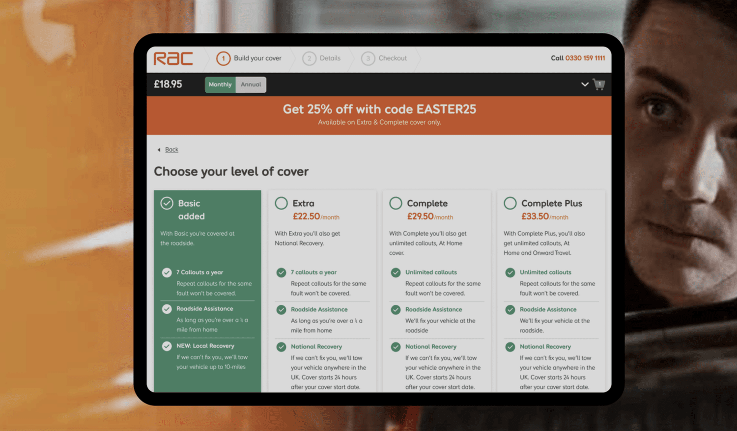
ProductRAC Breakdown Cover
The RAC gives more than 12.7m UK personal and business members peace of mind, from breakdown assistance to insurance and other motoring services.
Details
Problem
Customers needed an easier way to access, understand, buy and use breakdown cover across many touchpoints.
Solution
I led a research-led, mobile-first redesign of the whole journey, from first visit to policy management and getting help.
Result
Family safety, customisation and clear communication were built in and validated with moderated testing, contributing to higher satisfaction and loyalty.
Impact
CONTEXT
The RAC gives 12.7m UK members peace of mind, from breakdown assistance to insurance and other motoring services.
RAC asked for a comprehensive redesign of the entire UK Breakdown Cover journey, focusing on the experience from start to finish.
That meant how customers access, understand, purchase and use breakdown cover, across many touchpoints.
PROBLEM
Customers had to access, understand, buy and manage cover across too many touchpoints.
From gathering information to buying, managing a policy and actually getting help, every step had friction. Calls to customer service showed where people got stuck.
RESEARCH + KEY INSIGHTS
I built personas from customer-service calls, then followed customers through seven research streams.
How people look for cover and which channels they trust.
Interviews, surveys and usability studies on needs and worries.
Friction in checkout, renewals and policy changes.
Breakdown moments, other UK providers, A/B tests and conversion data.
INFORMATION ARCHITECTURE + REDESIGN
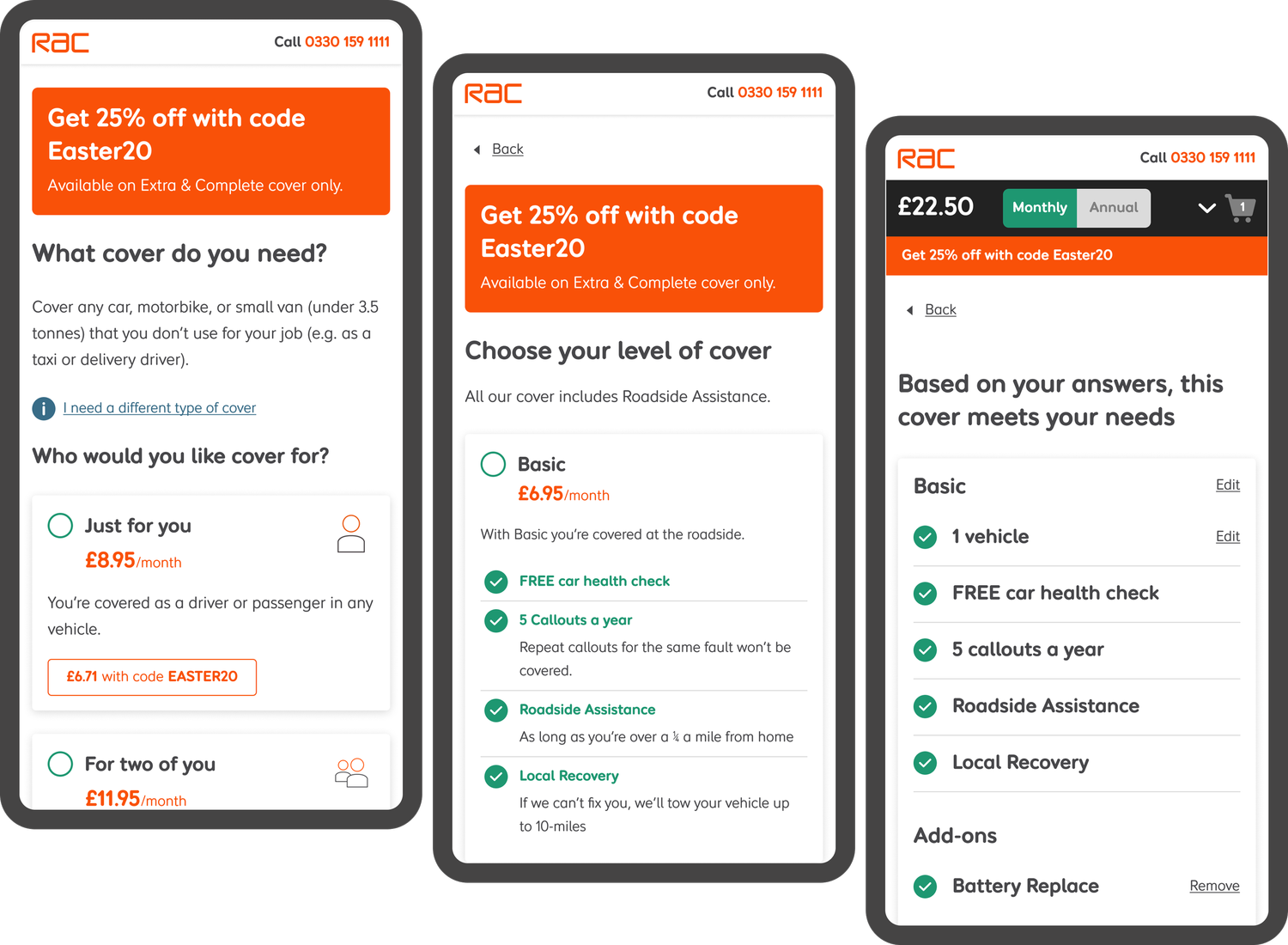
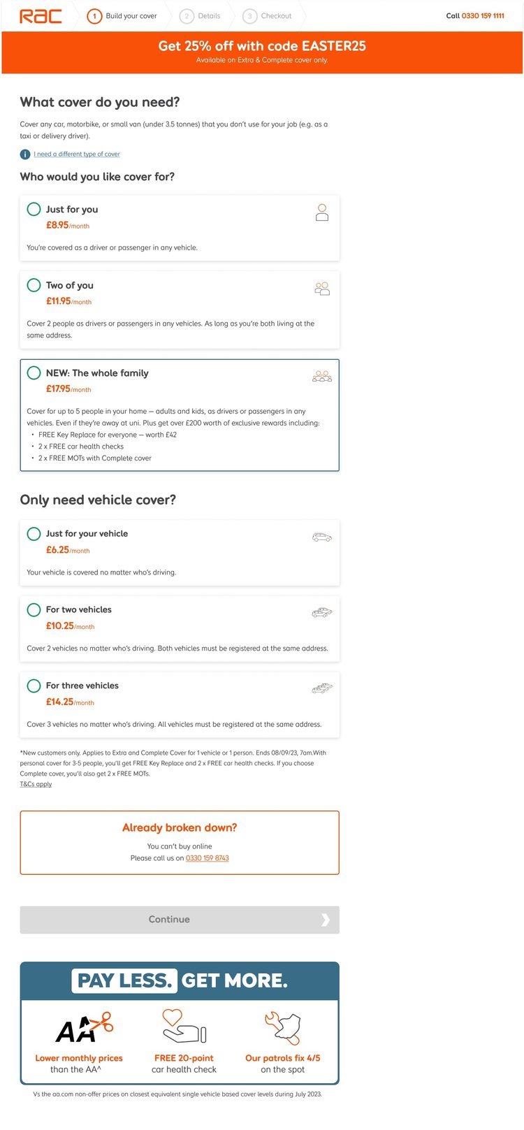
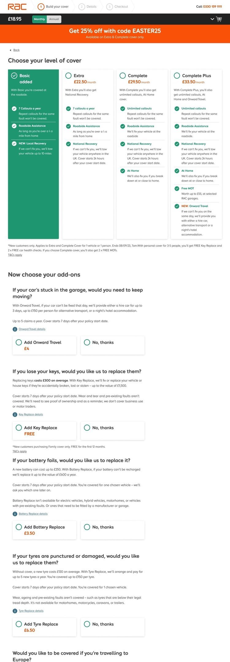
A clearer content hierarchy, then a mobile-first redesign of every screen.
I streamlined the content structure so people could find what mattered to them faster.
Then came wireframes, mockups and interactive prototypes, designed mobile-first, plus social-proof designs built with the Yieldify team.


USER TESTING
Test, learn, refine and repeat, at every stage of development.
Clear objectives, a mix of current and potential customers, realistic prototypes and remote think-aloud sessions.
I turned recordings and notes into a report with clear recommendations, then we refined and tested again.
CONCLUSION
A family cover journey that is user-friendly, customisable and responsive to real needs.
Interviews highlighted family safety, customisation and clear communication, and all three went into the design. Moderated testing validated the decisions and helped iron out usability issues.