Reimagining the matchday experience for football supporters
ProductMatchday app
A concept exploring how one mobile app could bring every stage of the fan journey together: before, during and after the match.
Details
Problem
Fans switch between many apps on matchday. Tickets, travel, stadium navigation and club content are all disconnected.
Solution
One seamless, accessible and personalised app that reduces friction before, during and after every match.
Result
In early concept testing, participants preferred Option A for its clearer hierarchy and easier navigation.
At a glance
OVERVIEW
Clubs now compete through the experiences they create for millions of supporters.
For many fans, matchday starts long before kick-off and continues well after the final whistle.
Supporting a club should feel exciting, not stressful. The challenge: reduce friction and build a stronger emotional connection.
RESEARCH
How do supporters really use football club apps today?
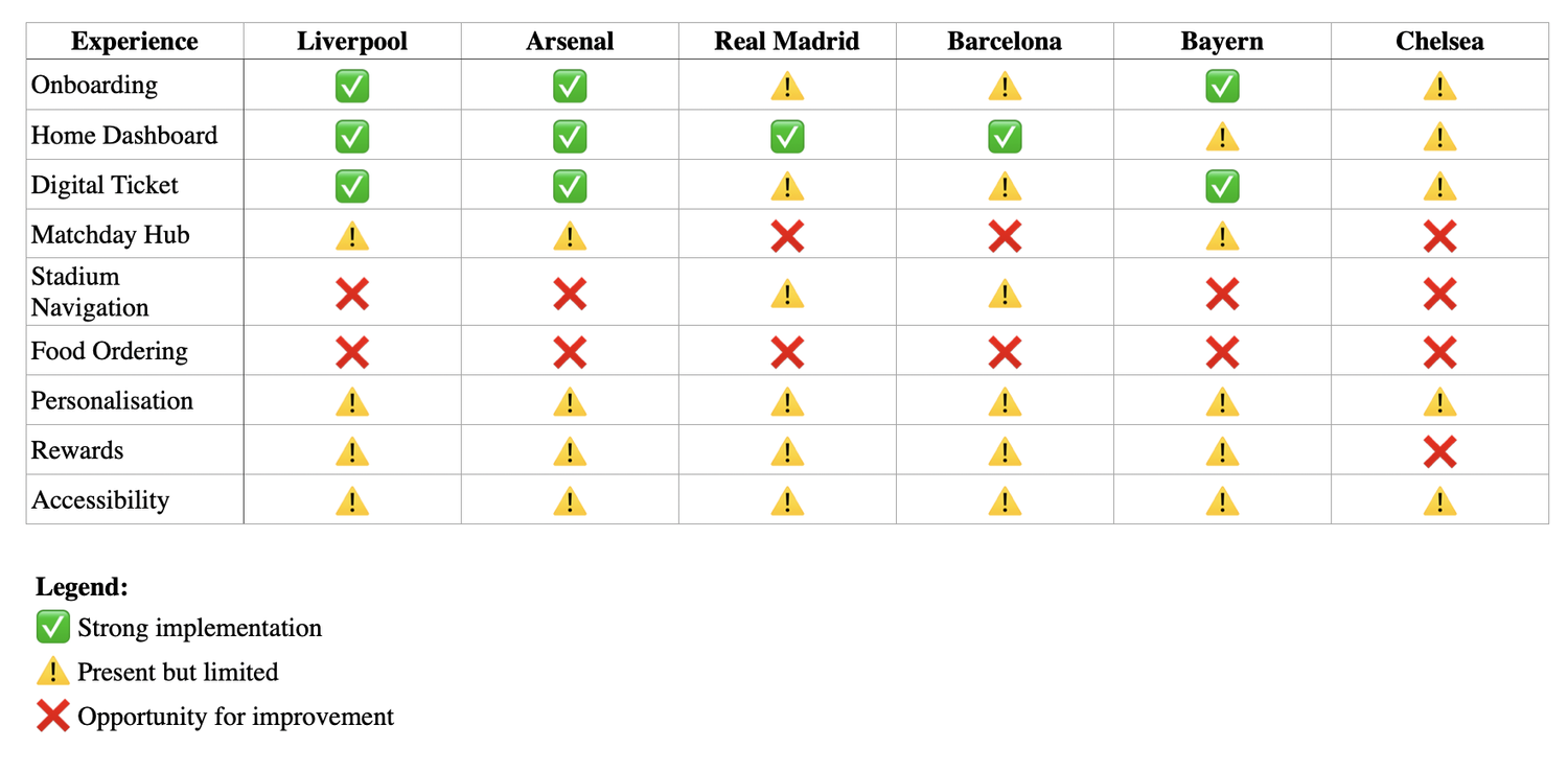
Six leading European football club apps.
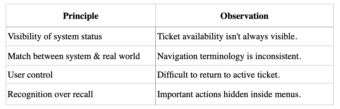
Using Nielsen’s usability principles.
Public user reviews.
End-to-end journeys, features and opportunities.
KEY FINDINGS
Matchday information was scattered, and engagement ended at the final whistle.
Info spread across many screens, and digital tickets needed unnecessary navigation.
Stadium wayfinding was hard for first-time visitors, and food ordering felt disconnected from the match.
Loyalty lacked visibility, and personalisation was limited despite rich data.
INFORMATION ARCHITECTURE
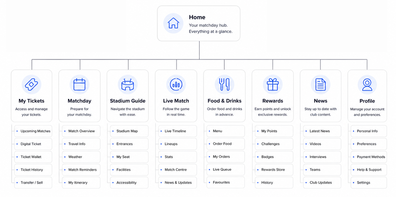
Two concepts, tested side by side. Option A won on hierarchy and navigation.
Preferred by users, better content hierarchy, easier navigation.
Too much focus on today’s match, and profile features were harder to find.
WIREFRAMES + UI
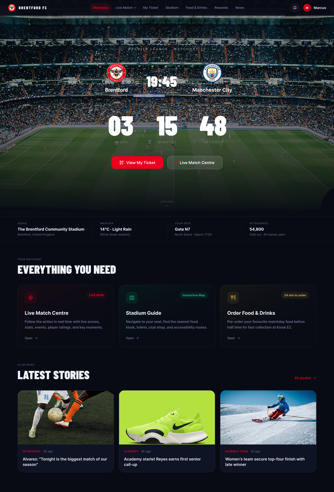
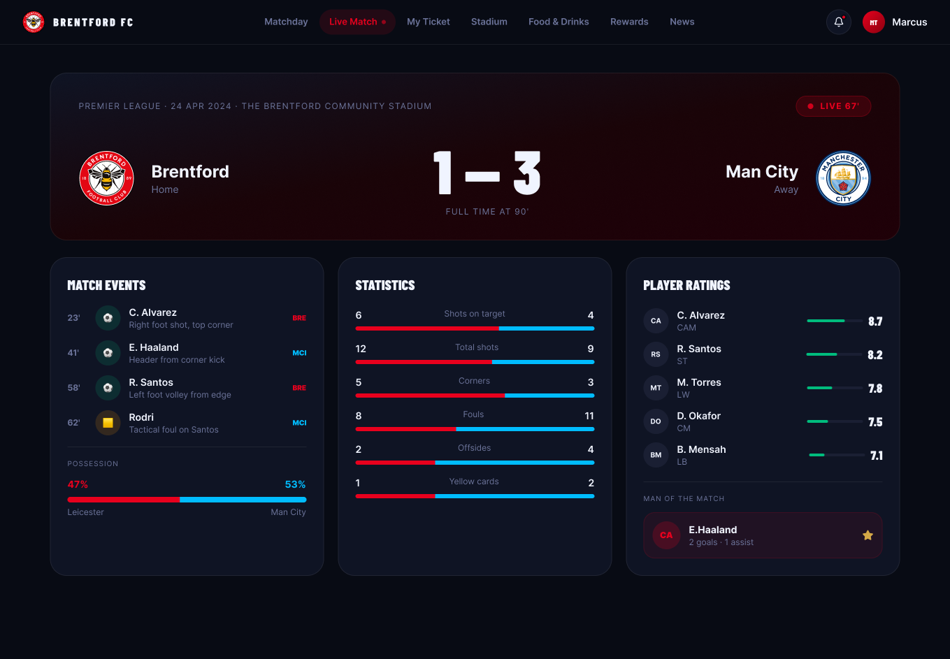
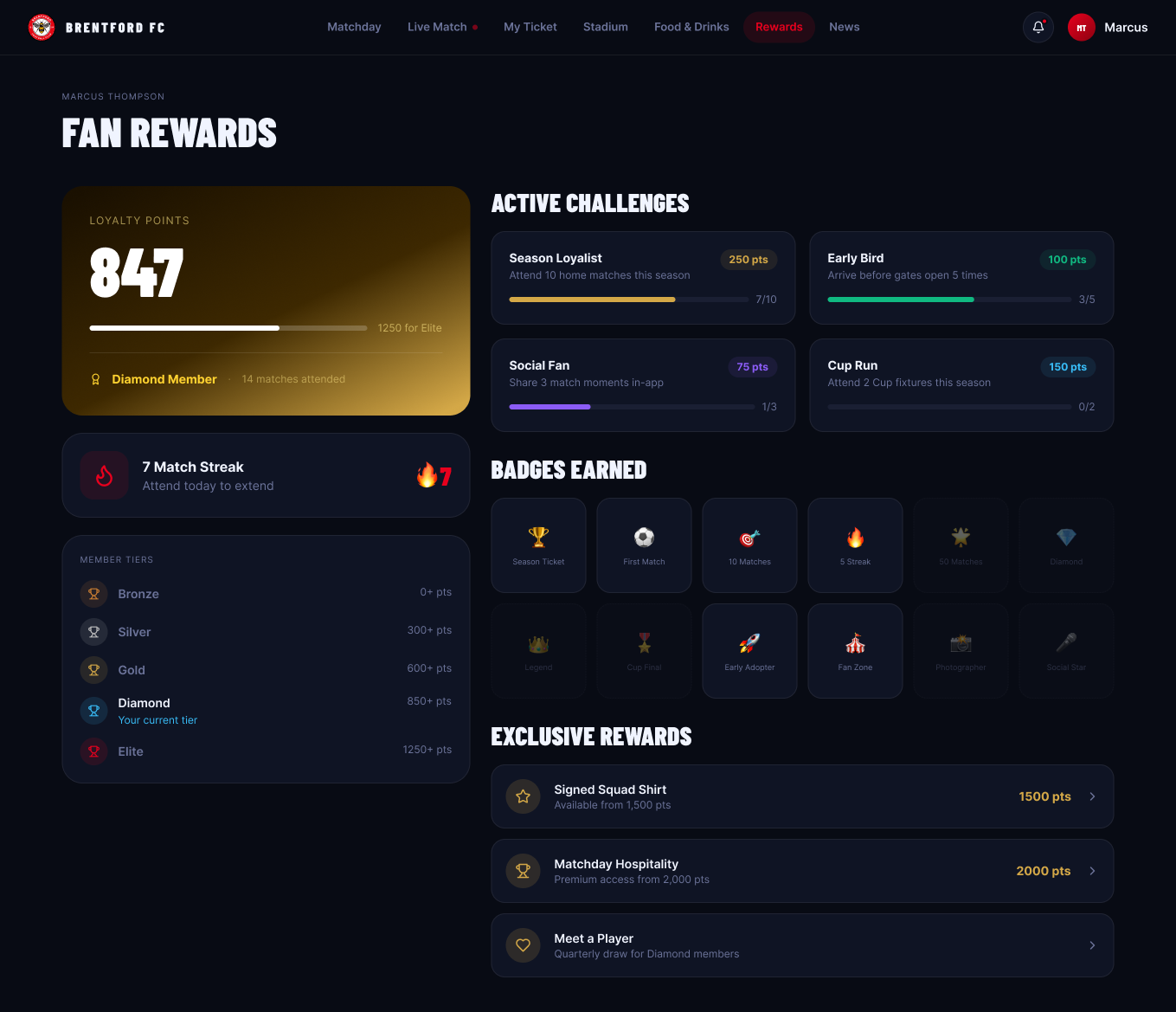
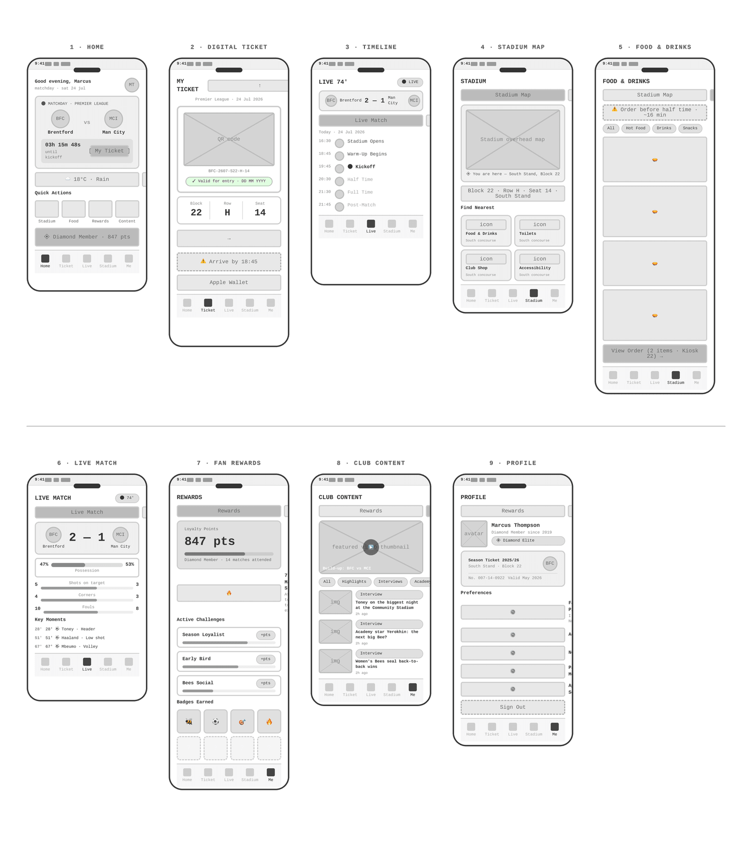
From wireframes to a premium fan app, with a web version alongside.